Inspire me
Pantone Color of the Year: Peach Fuzz
Join us as we glide into 2024 on the ethereal, velvety smooth hues of Peach Fuzz.

In the year before we celebrate the 25th anniversary of Affordable Art Fair, Pantone have shared their highly anticipated 25th Color of the Year, and it’s a blinder. Far enough away from millennial pink to avoid irrepressible flashbacks of the mid-2010s, with an ethereal, cloud-like airiness that instils confidence that not everything in the world is horrible, we’re pleased to welcome Peach Fuzz to the zeitgeist.
We don’t envy the pressure to choose a colour that defines a whole year. It all comes down to existing tonal trends, global talking points and pop culture influences before landing upon a new universal language of colour.
This year’s Pantone COTY is a testament to the times we’re living in, reflecting our collective mood, aspirations, and the design trends we can expect to see in 2024. We want to delve into what this year’s colour means, explore its potential impact on the art world, and highlight some pieces from our talented artists that already seem to be ahead of the curve.
All About Peach Fuzz
Nestled safely somewhere between pink and orange, PANTONE 13-1023 is a tender, heartfelt colour chosen for its ability to communicate tenderness and sharing. Soft yet fresh, Peach Fuzz inspires the opportunity to nurture and create an air of calm. It’s a real contrast to 2023’s rebellious Viva Magenta, instead instilling a sense of caring, community and recalibration.
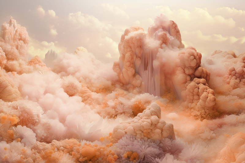

“At a time of turmoil in many aspects of our lives, our need for nurturing, empathy and compassion grows ever stronger as does our imaginings of a more peaceful future. We are reminded that a vital part of living a full life is having the good health, stamina, and strength to enjoy it.”
– Laurie Pressman, Vice President of Pantone Colour Institute
Having captured the global spirit of the time, Peach Fuzz is set to inspire creatives all over the world, so let’s see how you can introduce this silky, calming COTY into your interiors and ever-growing art collections for instant zen impact.
They called it
In many senses, Marcelina Amelia’s work exemplifies Pantone’s reasonings for immortalising this peachy tone across the world. Having spent recent years dealing with anxiety driven by our chronically online lives, Amelia has rediscovered her Polish folklore roots for a journey of healing. The result of this appears to be a pre-emption of the colour we’ll all be turning too for a similar experience this year – Peach Fuzz and its ability to instil a sense of sanctuary.
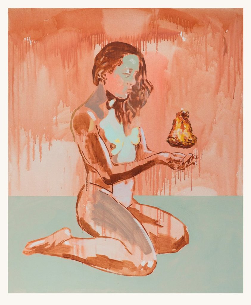
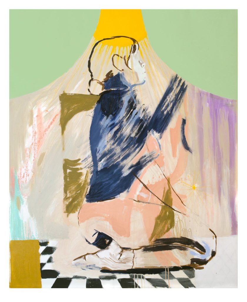
You can find this colour throughout her recent work, whether it dominates the canvas or accents other soothing hues, such as in ‘Bitter Lamentations’. With a slightly earthy twist, you can expect a palette such as this to create a closer connection to nature in your interior, and an ambience of nourishment for those cosy central spaces in your home.
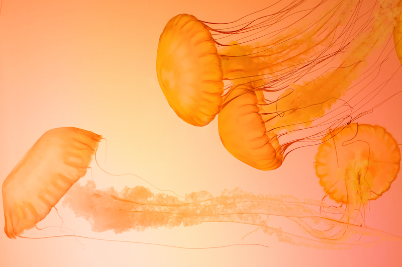
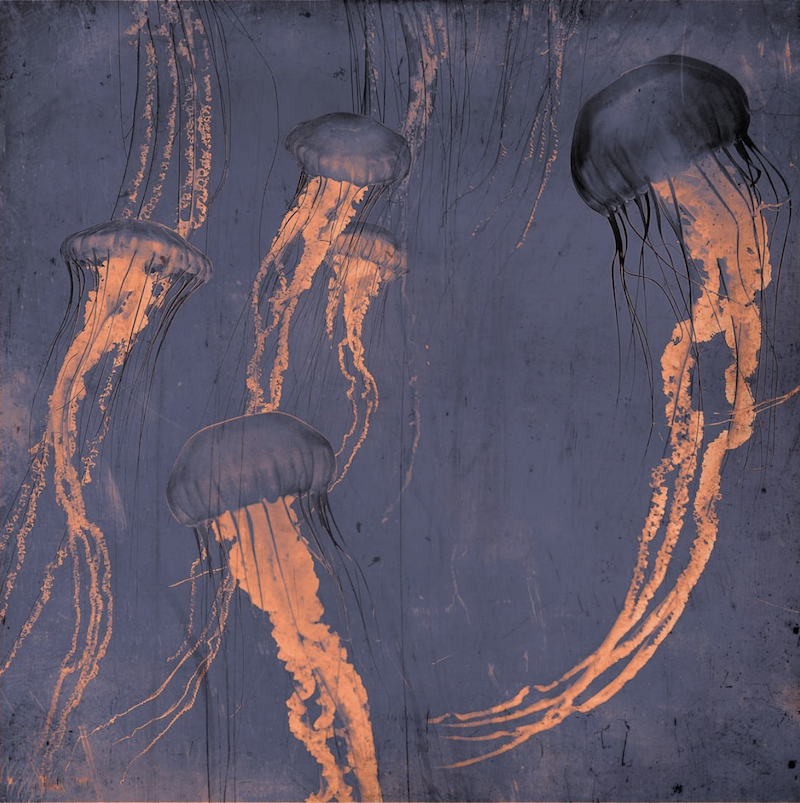
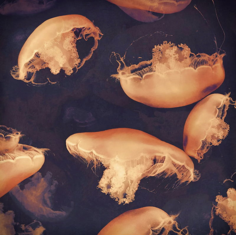
From the deliciously peachy pool of images in Pantone’s Media Kit, we were excited to see one shot in particular that nods to the work of Nadia Attura, a favourite Affordable Art Fair artist around the world. Her jellyfish photography series has definitely pre-empted the Peach Fuzz. The sense of inversion strikes a real contrast between the dark, oceanic background to make the ghostly jellyfish standout with an uncanny result; capitalising on both dark and light to suit any future-proof interior. Attura’s signature intent to take a zoomed-in look at our ideas of paradise and idealism suit Pantone’s COTY to a tee.
A 3D take
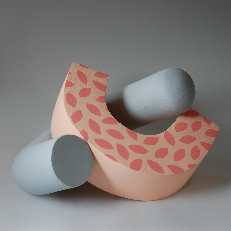
Smooth or spiky, the abstract shapes of Patricia Volk are enhanced by her careful colour choices. As a sculptor, Volk loves working with clay to create one-of-a-kind pieces, which are fired and finished with acrylic paint. The different shapes within the same sculpture might represent strength and fragility, stability and precariousness.
Over the course of 2023, we’ve seen a real interest in sculptural works. That tactility and ability to provide a focal point for a room seems to be what we’re all craving in our homes. So, with artists such as Volk evolving past perceptions of classical sculpture as sterile, it’s easier than ever to celebrate what colour can do for 3D forms.
Inspired by nature
Melbourne-based Mia Pensa (@miapensa) is another artist who is on the cutting edge of colour. Her palettes often have peach-adjacent properties and a laid-back aesthetic lends itself well to elevating a space into the realm of relaxation.
Colour theory screams the need for a contrasting green, so Pensa’s jungle imagery with giant palm fronds and leafy landscapes is the perfect subject matter to make Pantone proud of how their COTY is being used by creatives across the world.
And it’s not just painting where we’ve seen Peach Fuzz prevail. Greg Nicolai’s (@feelingitstill) photography has captured the orange sunshine elements, particularly in his ‘Soft Sunrise’ (main image) and the pink, still morning light of this Morrisville farm. Although disparately silky versus saturated, the two timeless artworks could be paired perfectly to bring out the best of the peachy tones.
Perfectly paired
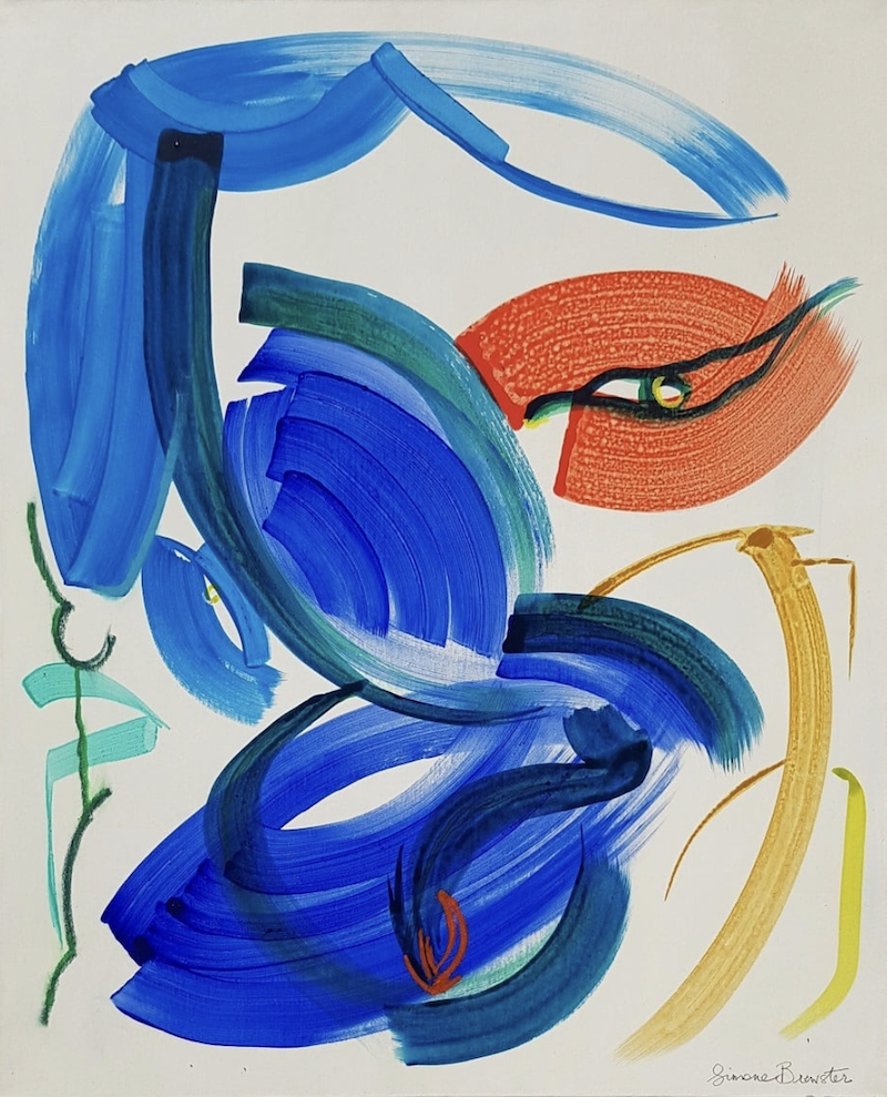
Although Peach Fuzz is the protagonist for 2024, we need supporting characters to really bring it to life. You might wish to take inspiration from other key colours trends for the year ahead, such as a dusky, cadet navy, just like Nadia Attura’s ‘Monterey’ jellyfish. Or, we love the idea of peachy colours alongside a vivid, electric blue. Simone Brewster is a champion of this colour, with her abstract works making big impact with broad brushstrokes and powerful palettes. If you manage to snag an artwork in 2024 that aligns with Peach Fuzz, finding an electric blue piece to pair alongside will be an unrivalled match.
Or, lean into the calming pastel aesthetic. Like glimpsing a surreal, endless horizon, Kean’s (@onekean_) paintings feel both expansive with a real sense of escapism. In his ‘Underwaterfall’, we see Peach Fuzz take centre-stage whilst blending out into delicate blues and rich pinks.
All the colours work in harmony, just as they do in Parsley Steinweiss’ (@parsleyoooo) ‘Light Form I’. These works speak to the quietly sophisticated nature of Peach Fuzz, using lightness and depth to bring natural beauty into our largely digital world.
So, that settles it, Peach Fuzz is going to be everywhere this year – in our homes, our design preferences and fizzing away in our creative brains. However you feel about Pantone’s COTY, lean into its versatility and make sure to keep an eye out on how it manifests in the art world. We’re certain to see more of it creeping into our fairs as we crave to inject our personalised worlds with a comforting presence. We’ll see you there!
Main image: Greg Nicolai, ‘Soft Sunrise’, 2020, photography, 30 x 56in, Greg Nicolai Fine Art Photography
