2024 Colour Trends: Make Them Timeless
Colour is a powerful tool that can transform spaces, evoke emotion, and define your personality, but how can you transcend fleeting fads in 2024?

Just like fashion and technology, colour trends are always evolving, reflecting our collective mood, cultural shifts, and societal changes. With 2024 on the horizon, we want to dive headfirst into the future of colour to explore how fresh palettes will seize artistic inspiration over the course of the year.
This blog post is designed to equip you with knowledge to make informed colour choices for your art collection that won’t just look great next year, but for many, many years to come. Join us as we look ahead to what palettes are predicted to trend, and how to integrate these colours into your art collection for a timeless effect.
Ocean blue, lemon yellow, pea green, azure

This refreshing colour palette evokes thoughts of sunny days and verdant landscapes. As a combination, the azure blue makes us think of clear, calming skies or Mediterranean swimming pools, whilst the pastel lemon yellow adds a burst of sunny, fruity energy. When brought together, these colours are ideal for inspiring a sense of natural beauty.
Where trending palettes tap into a longstanding creative influence such as the natural world, this is a great place to start in terms of artwork hunting for timeless pieces.
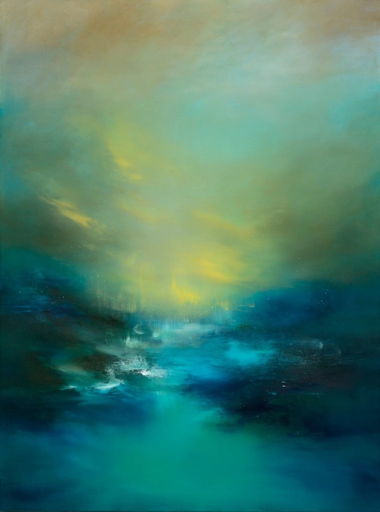
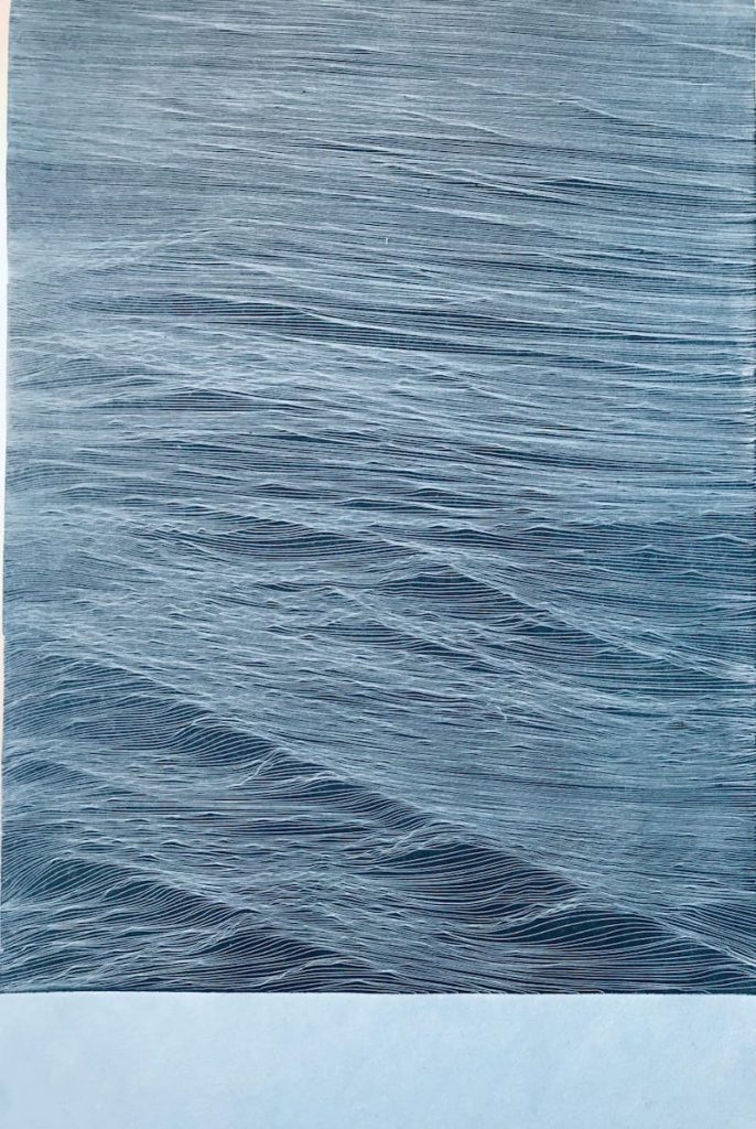
Momo Puente Piazza’s work often finds itself drifting into this 2024 colour palette. The seamless merging of hues is fresh, transportive, and balanced so that an artwork such as ‘Emotion VI’ (main image) would fit into any future-proof interior. Evocative of the Northern Lights or wintery scene, this piece both captures the colours of the moment, whilst tapping into transcendent themes.
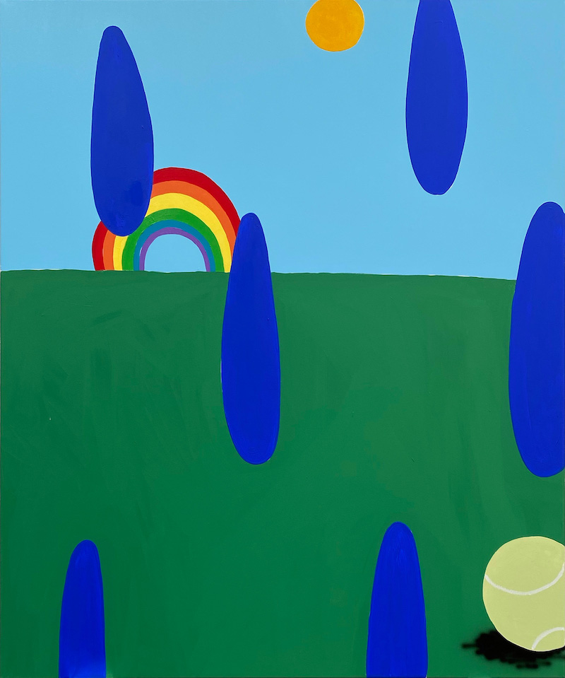
Although David Bruce’s ‘Rainbow’ painting takes a more deliberately naïve approach to natural colour, the palette still reflects those predicted to takeover 2024. The colour blocking technique feels distant from Piazza or Ancog’s dedication to the gradient style, yet both are aligned in pre-empting a colour range that we’d love to see in our homes for a lifetime.
Red, sage green, dark pink, rooibos brown

This colour palette is all about warmth and depth. The orangeade punch creates dynamic contrast with the soothing, peppery green, so that elements of passion and growth intertwine. Underneath it all, the rooibos brown grounds the palette, tying together the psychological emotions associated with warm, earthy hues; balance, renewal, and stability.
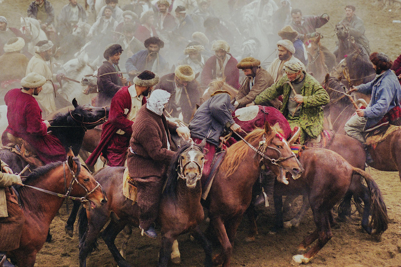
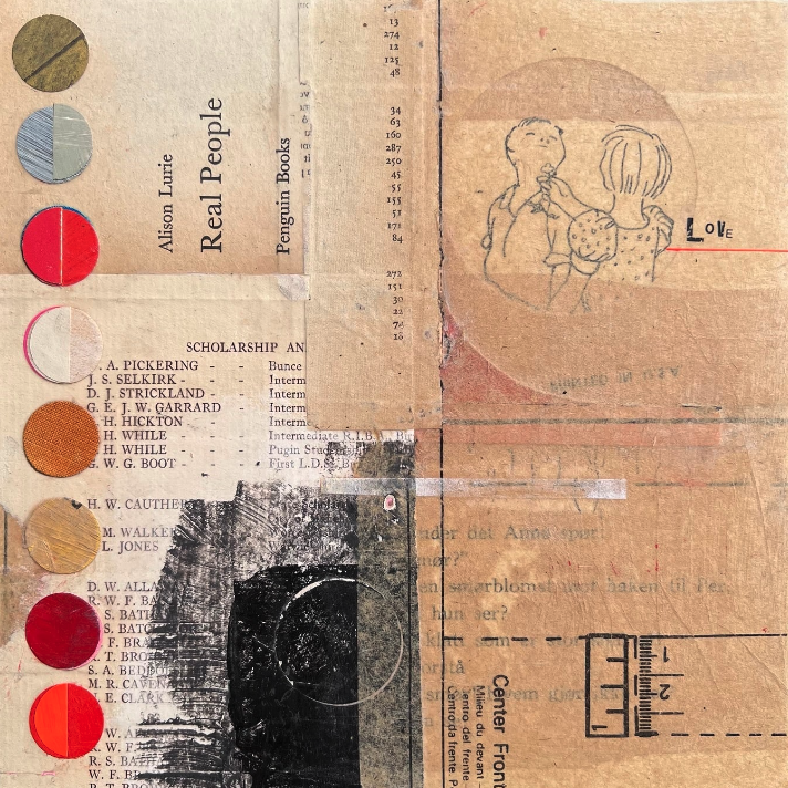
This is what makes this colourway feel as though it has everlasting potential when it comes to incorporating into your art collection. The feelings inspired by plusher tones can offer elegance and richness. Where the colours are taken from real life, such as within the photography of Ahmet Sel’s ‘Buzkashi I’, you can be have a slice of realism on you walls. On the other hand, Emma Davis interprets this palette in a more abstract way with the mixed media circles to the left of her ‘Love’ collage. We’d love to see a piece like this hung in a living space, where that cosy feeling is always sought after.
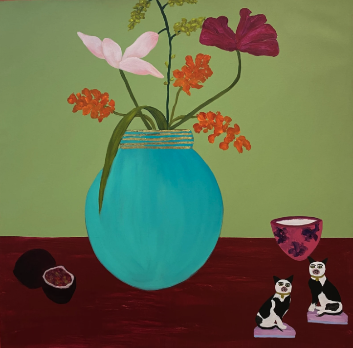
The green elements outweigh all in Dawn Beckles’ ‘Forever the Cream’, with its watercress green background complemented by splashes of varying pink. The contrast between the background and tablecloth is beautiful and causes your eye to flit from one element to the next until you’ve consumed the whole canvas.
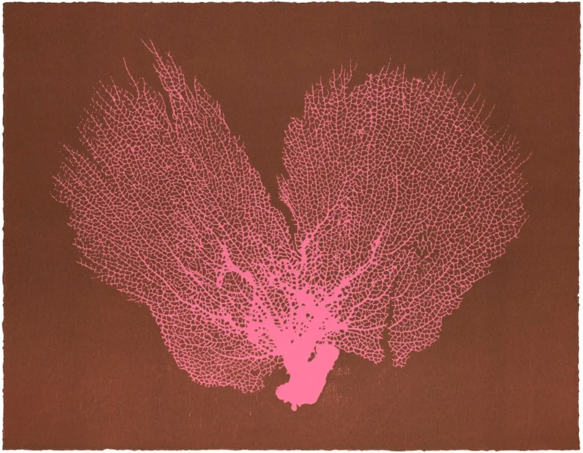
Jo de Pear’s ‘Sea Fan’ series is always popular. She has a keen eye for delicious colour trends, but the simple beauty of her prints works in tandem to keep things timeless. She foresees the trending colours of 2024 to pluck a vibrant pink and dark brown from our second palette, and the effect is certain to last way beyond any potential fickle fads!
Lush pink, coral red, lime green, dusky blue, chocolate brown

This combination has been utilised by artists across centuries, from the impressionists’ dreamy landscapes to contemporary abstract paintings, proving its timeless appeal. We love its scope and the number of creative options it offers in terms of colour combinations. Pick two, three, four, or all five hues, and they’ll work harmoniously together.
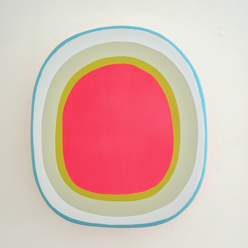
Take the red and green concentric circles of Laurie Skantzos’ wall sculpture, fresh from her ‘Portal’ collection. Regardless of the changing trends, this palette continues to resonate deeply with viewers, creating art that transcends time and captivates generations. These famous enemies (think red and green should never be seen) join together to create a focal pop of colour that instantly subdues the surrounding colours.
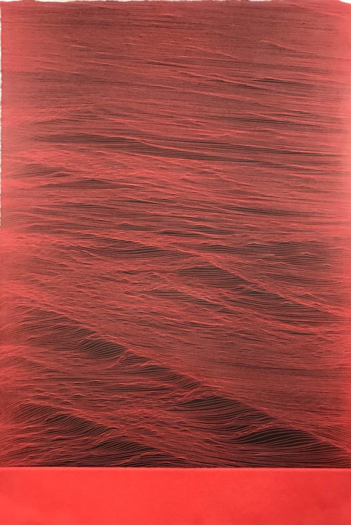
Likewise, plucking the vibrant, coral red and dusky blue from this palette can offer you the perfect pairing opportunity. The etchings of Juan Escudero are minimalist in nature but make a huge impact when hung together. If your walls at home match any of their 2024 colour friends, you’re onto a winner with a complementary display similar to this.
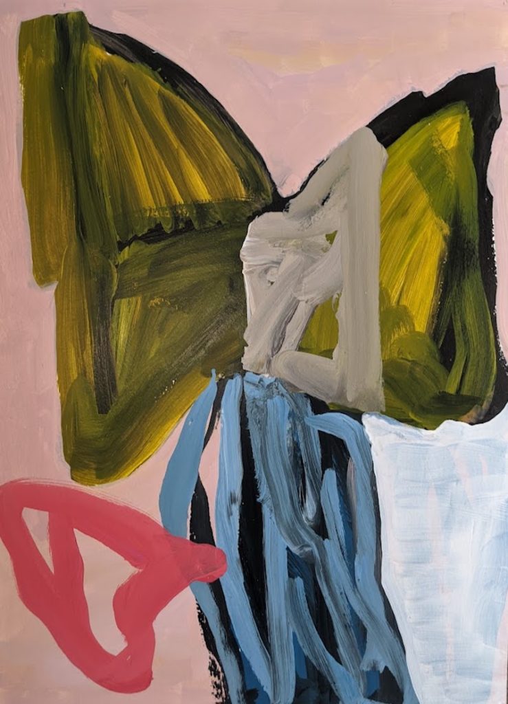
As we head into 2024, you might start to notice this colourway inspiring more and more artists. We love the work of Henry Ward and the variety within his abstraction, so imagine our excitement to find this expressive piece – ’20 July 2022’ – that sings with pink, green, blue, red, and mossy brown. Five ticks of approval from both us and the upcoming year’s palette. An inspired choice even two years after its creation, proving colour trends can come and go, but art will last a lifetime.
At your next Affordable Art Fair, make sure to keep an eye out for these colourways – you’ll be surprised to see how often they’re depicted in contemporary art as the trends of 2024 begin filtering into our brains. But what remains important is a broadened vision that allows you to see the joy a new piece will bring into your home forever. Luckily for you, 2024’s colour palettes are certified timeless.
Main image: Momo Puente Piazza, ‘EMOTION VI’, 2022, mixed media on iron sheet, 100 x 100cm, OCCO Art Gallery
