Art advice
Borrowing Colours From Nature
Discover the power of natural colour palettes and find out how contemporary artists borrow colours from nature to create extraordinary art.

Erin Peacock
Thursday 4 May, 2023

It’s hard to imagine what the history of art might look like without the influence of nature. Whether we look back at prehistorical art forms – petroglyphs, cave paintings or Stone Age sculpture – or right up to 19th century post-impressionist landscapes; you’re sure to find Mother Nature’s influence across almost every artwork, whether that be subject matter or colour palette. Even now, the tones to be found in our natural world still offer artistic inspiration in spades.
Be inspired by four movements, mediums and artists that champion the process of borrowing colours from nature to create extraordinary contemporary art.
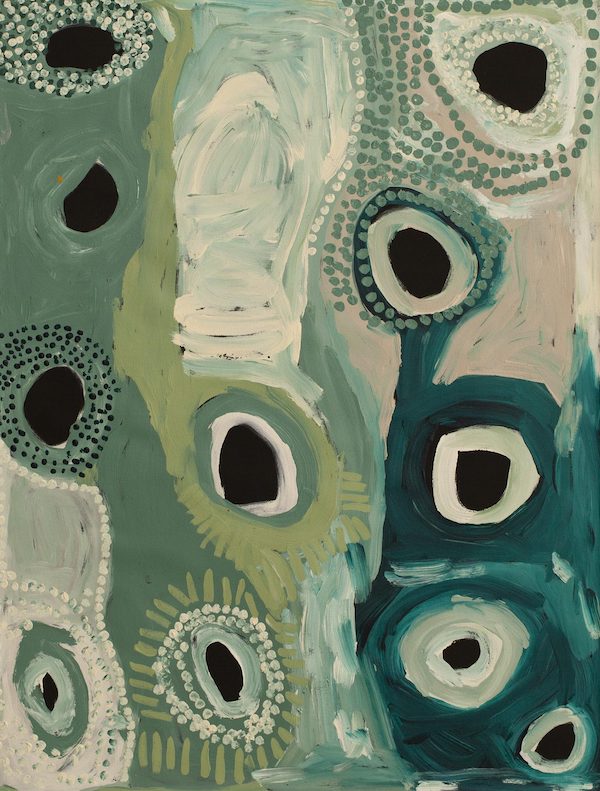
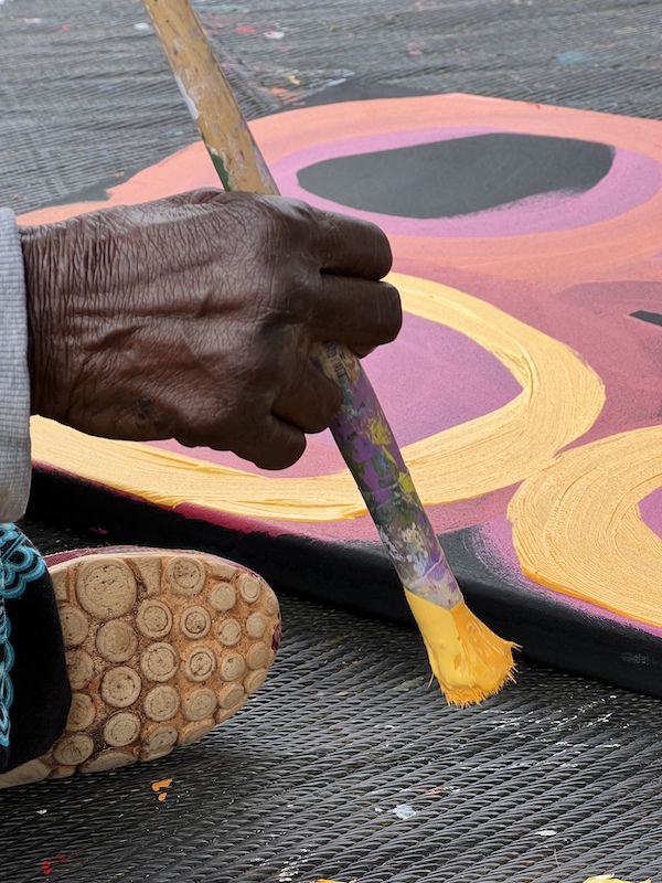
Aboriginal art
For at least 60,000 years, Aboriginal people have lived in Australia utilising art as a pivotal form of communication. With strong ties to the country, Aboriginal culture takes inspiration from the seasons, animals and spirits of the land. The art always tells a story and is deeply connected to nature in every sense.
Aboriginal and Torres Strait Islander art therefore epitomises the idea of borrowing colours from nature, as the very crux of the movement is focused on the inspiration found in every aspect of the land.
The Papunya art movement of the late 1960s marks the real beginning of Aboriginal art in a contemporary sense, where ochre pigments were mainly used, or considered traditional, in reflecting the hues found in the Australian earth.
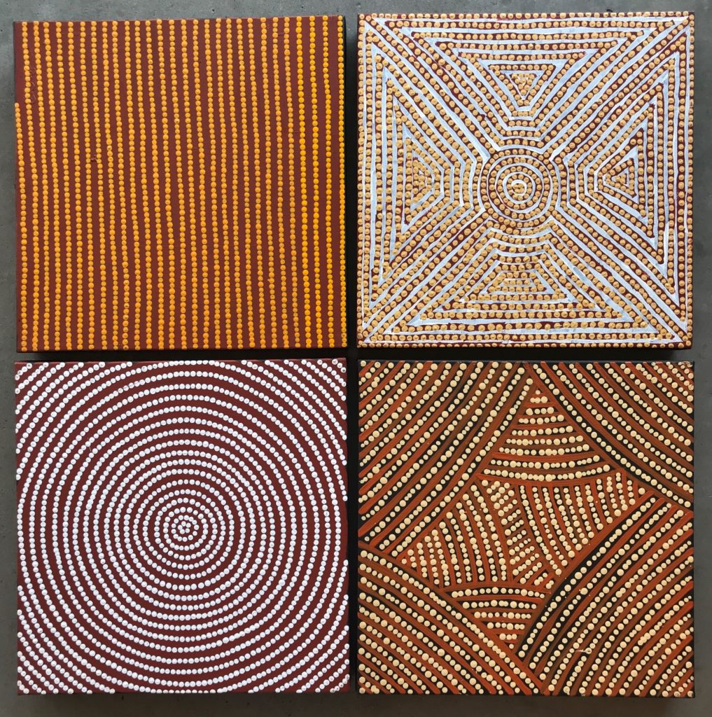
Now, these palettes have expanded to include cooler tones, perhaps inspired by bodies of water or seasonal changes, as well as the warmer, earthy hues that form the backbone of Aboriginal art. Either way, the borrowing of these colours from nature proves to demonstrate a profound connection to, and appreciation of, nature, free from appropriation.
Seasonal abstracts
Interpreting an abstract artwork is always an interesting and exciting plight, and one that so often triggers an emotional response. Where colour palettes are borrowed from nature and used for abstraction, this appears to increase interpretive options tenfold because so much of our natural world is inherently abstract.
Looking at the work of Keith Ancog, a triptych from his ‘Envisage’ editions use three very different colour palettes borrowed from three very different pools of landscape.
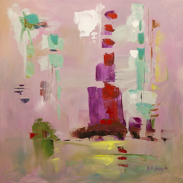
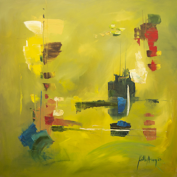
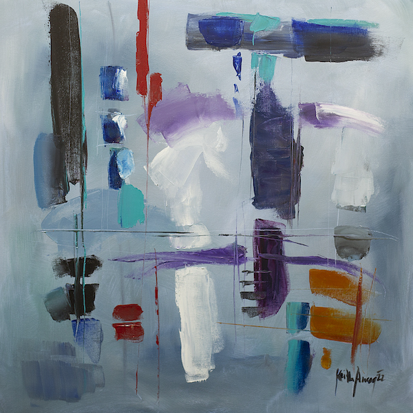
The pink, red and seafoam of ‘Envisage 8’ seem to be drawn from floral inspiration, whilst ‘Envisage 5’ gives the impression of a junglescape or more tropical palette. The third painting, ‘Envisage 3’ takes inspiration from darker, stormy hues associated with the meteorological aspects of nature. When hung together, the three paintings appear to have industrial qualities, having borrowed colours from nature, but in practice stimulating the shapes and linework of the architecture within an abstract cityscape.
Cool earth tone sculpture
Although it’s often seen as contemporary to recontextualise and innovate, deriving materials directly from the earth often lends itself to a more subdued colour palette that reflects the origins of a particular medium. Wood and clay are both materials used commonly in sculptural work, and both bring to mind tones that match the relaxing, transportive elements of their tactility.
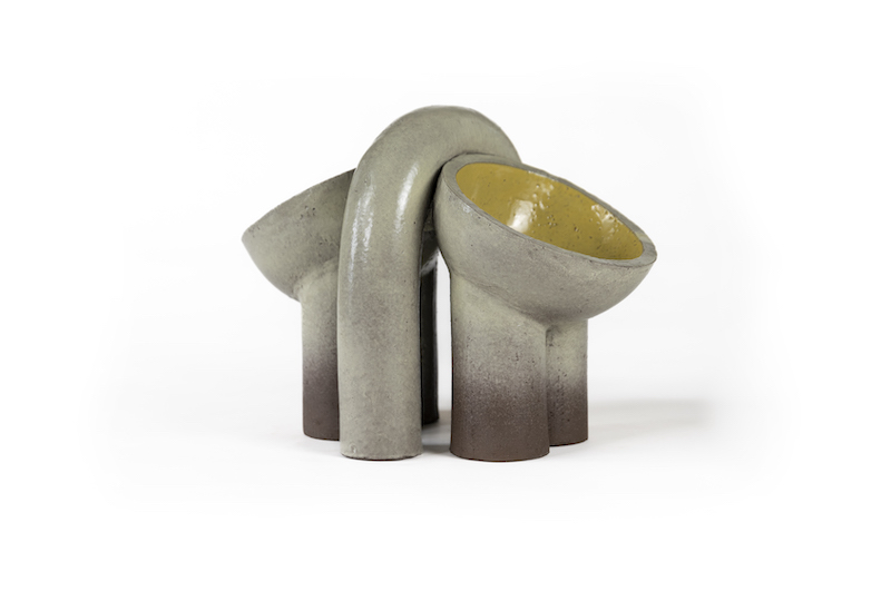
Gilles Mayk Navangi and Pieter Bostoen work with ceramics to create futuristic shapes that simultaneously reflect the bodies of animals. Thus, they borrow colours directly from the fauna that inspires them. And despite the apparent whimsy, there is also a deeper cyclical element in the material choice, in terms of their bodies being solidified from the earth in which their remains are a part of. Where the colours are cool, the feeling is peaceful and regenerative.
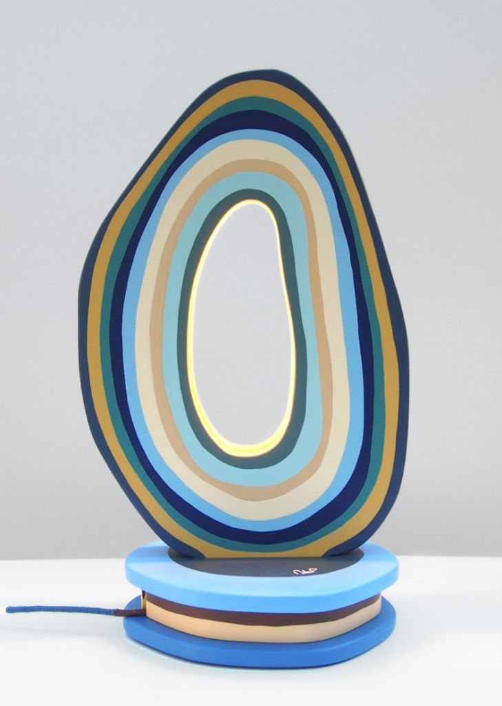
Likewise, Margaux de Penfetenyo’s recycled wooden sculpture, which also functions as a table lamp, evokes the rings of a tree trunk with seascape colours of cadet blue, cardinal grey and sandy ochre.
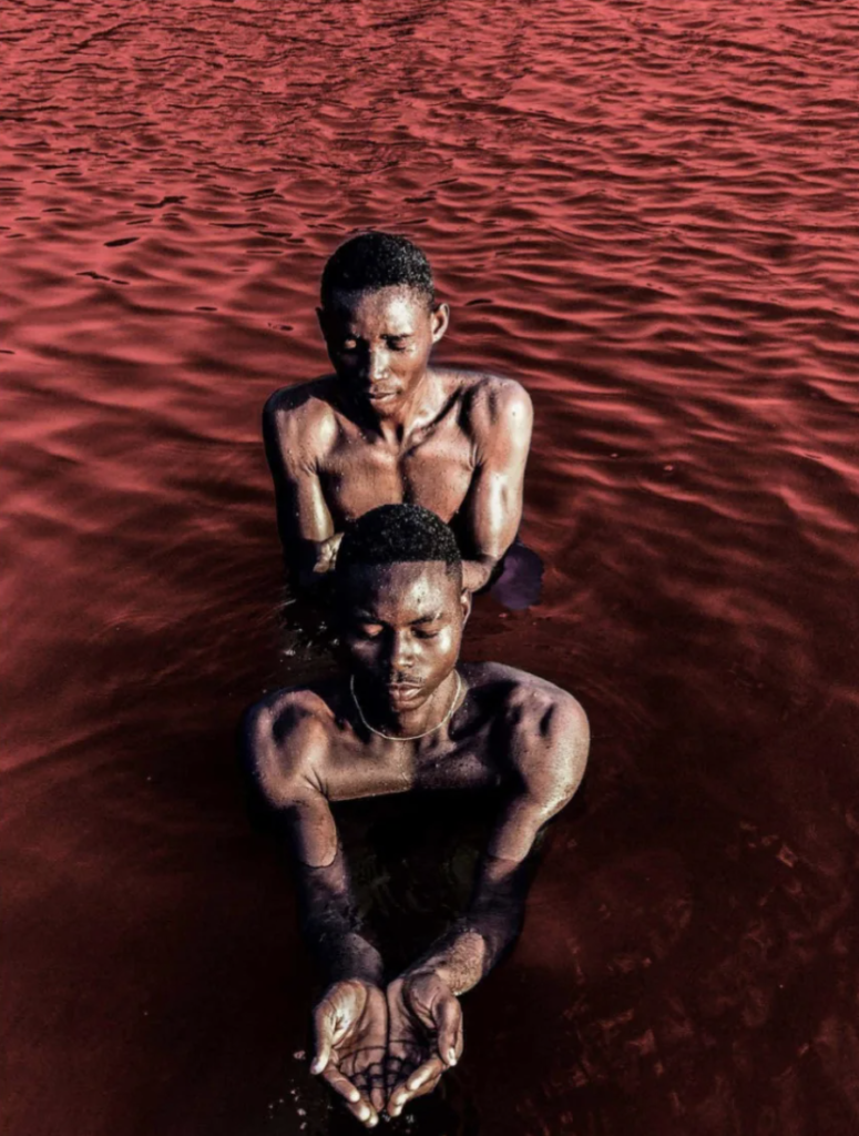
Enhancing colours from nature
With modern photographic techniques, wildlife or figurative fine art photography can act as a medium that enhances the colours found in our natural world.
Inspired by his home country of Ghana, Derrick Ofosu Boateng composes saturated images on his iPhone that take a closer look at Ghanaian culture through a worldview lens. Colour plays a hugely important role in his work, and whether it’s the sea, the earth or the sky, everything has a touch of exaggeration that demonstrates the beauty, vibrancy and visual poetry of a whole continent that is still vastly underrepresented in the art world.
Full of joy, positivity and nurturement, Boateng’s work demonstrates how natural hues doesn’t need to be like-for-like to evoke a connection to nature.
Thinking about specific colour palettes when considering adding to your collection is a guaranteed method to curatorial success! Where natural hues are concerned, it’s hard to go wrong. By mixing warm and cool, or bright and subdued, you can quickly evoke the calming, restorative elements of our extraordinary planet into your art collection.
If you want to dive deeper into the theory of earth tones, tap below to explore our guide to the benefits of a home that centres its decor around a connection to the land.
Main image: Bob Gibson, ‘Patjanta’, acrylic on canvas, 147 x 177cm, Yaama Ganu Gallery